
KPI Dashboards That Actually Drive Decisions for Mission-Driven Businesses
If you're running a nonprofit or small mission-driven business in the Brazos Valley or Northern Houston area, you know the drill: budgets are tight, donors are watching every dollar, and you've got to prove your impact without drowning in data. That's where KPI dashboards come in - not the fancy ones that look pretty but do nothing, but the kind that actually help you make smart calls, like reallocating funds to high-impact programs or spotting cash flow hiccups early. As a CPA with over 20 years in nonprofits and small business, I've seen how the right setup can turn chaos into clarity, especially in volatile times like 2026 with shifting donor trends and economic squeezes. Let's break this down simply, with tips you can use right away.
Why Bother with KPI Dashboards in 2026?
Mission-driven orgs aren't just about profits; you're balancing impact, compliance, and sustainability. But with rising costs and grant scrutiny (think new IRS rules on charitable giving), you need real-time insights to stay agile. A good dashboard pulls from your accounting tools - like QuickBooks Online or Sage Intacct - and visualizes key metrics without overwhelming you. No more staring at spreadsheets for hours; instead, spot trends at a glance and drive decisions that align with your mission, whether it's serving underprivileged communities or animal welfare.
The key? Focus on 5-10 KPIs that matter most to your goals, not everything under the sun. Overloading leads to "analysis paralysis," where data sits unused. For nonprofits with $500K-$5M budgets, this means blending financial health with impact metrics.
Top KPIs to Track for Real Impact
Based on 2026 trends, here's a curated list of essentials - tailored for orgs like animal rescues or community services. I've pulled from proven frameworks to keep it practical. Aim for a mix of financial, operational, and mission-specific ones:
-
Donor Retention Rate: Percentage of repeat donors year-over-year. Target: 60-70%. Why? Loyal donors are cheaper to keep than new ones, especially with 2026's economic dips affecting giving. Formula: (Repeat donors / Total donors last year) x 100.
-
Fundraising Efficiency Ratio: Cost to raise $1. Target: Under $0.20. This shows how much bang you get for your fundraising buck - crucial for grant-dependent orgs. Formula: Fundraising expenses / Total contributions.
-
Program Expense Ratio: Percentage of expenses going to programs vs. admin. Target: 75-85%. Donors love this; it proves your money fuels the mission, not overhead. Formula: Program expenses / Total expenses.
-
Current Ratio (Liquidity): Assets vs. liabilities. Target: 1.5-2.0. Ensures you can cover short-term bills without panic-selling assets. Formula: Current assets / Current liabilities.
-
Impact Metrics (e.g., Individuals Served): Track outcomes like people helped or animals adopted per dollar spent. Customize this - for an underprivileged support org, it might be "meals provided per grant dollar." Use standardized tools like IRIS+ for credibility.
Bonus for 2026: Add revenue growth (annual increase in funds) and cash reserves (months of expenses covered) to weather recessions. These help with board reports and 990 filings, keeping everything audit-ready.
Building Your Dashboard: Simple Steps Without the Tech Headache
You don't need a full IT team - tools like Power BI (which I use for clients) integrate with your existing setup for dynamic views. Here's a quick guide:
- Define Your Goals: Start with your mission. What decisions do you need data for? E.g., "Should we expand our animal welfare program?"
- Pick Your Tools: QuickBooks for basics, Power BI for visuals. Pull data from Stripe for donations or ADP for payroll oversight.
- Design for Action: Use charts over tables—pie charts for ratios, line graphs for trends. Keep it to one screen; update monthly during closes.
- Automate and Review: Set alerts for red flags, like dipping donor rates. Review quarterly to tweak.
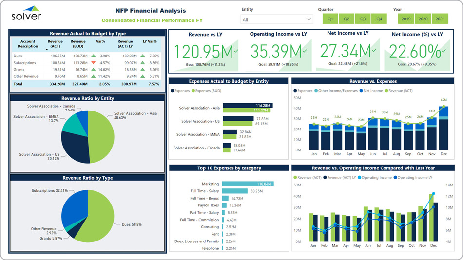
For example, here's a clean financial dashboard showing revenue vs. expenses and program breakdowns - great for spotting where grants are underperforming. (solverglobal.com)
And this one mixes impact with budgets, like individuals served by program - perfect for mission-driven reporting. (https://www.sage.com/en-us/blog/dashboards-for-nonprofits/)

I've built these for clients, saving them hours weekly by automating what used to be manual Excel grinds.
Common Pitfalls to Avoid
- Too Much Detail: Stick to actionable KPIs; skip vanity metrics like social media likes unless they tie to donations.
- Ignoring Trends: Static reports miss the boat - use dashboards for year-over-year comparisons.
- Data Silos: Integrate everything; disjointed tools lead to errors, especially in fraud-prone areas like grant tracking.
In my experience at places like Reach Unlimited, blending these into controller services cut external fees by 30% while boosting donor confidence.
How FoxLedger Can Help
At FoxLedger, we specialize in fractional controller services that include custom KPI dashboards - starting at $1,600/mo for our Plus tier, tailored for TX nonprofits with $1M+ revenue. We handle the setup, training, and ongoing tweaks, so you focus on your mission. No steep learning curves; just scalable insights that drive real decisions.
Ready to get your dashboard humming? Book a free consultation - let's chat about your needs in the Brazos Valley.
Thanks for reading - here's to making 2026 your best year yet!